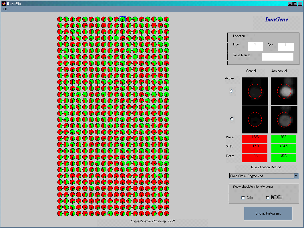
GenePie Plots
The GenePie visualization is a differential expression display. Each pie chart shows the level of differential gene expression at each spot in the experiments.
When you select a pie spot the actual images from both experiments along with their calculated data will be displayed on the right-hand side of the screen. In the example above the selected gene was much more strongly expressed in the experiment labeled by the color green than in the one labeled by red.
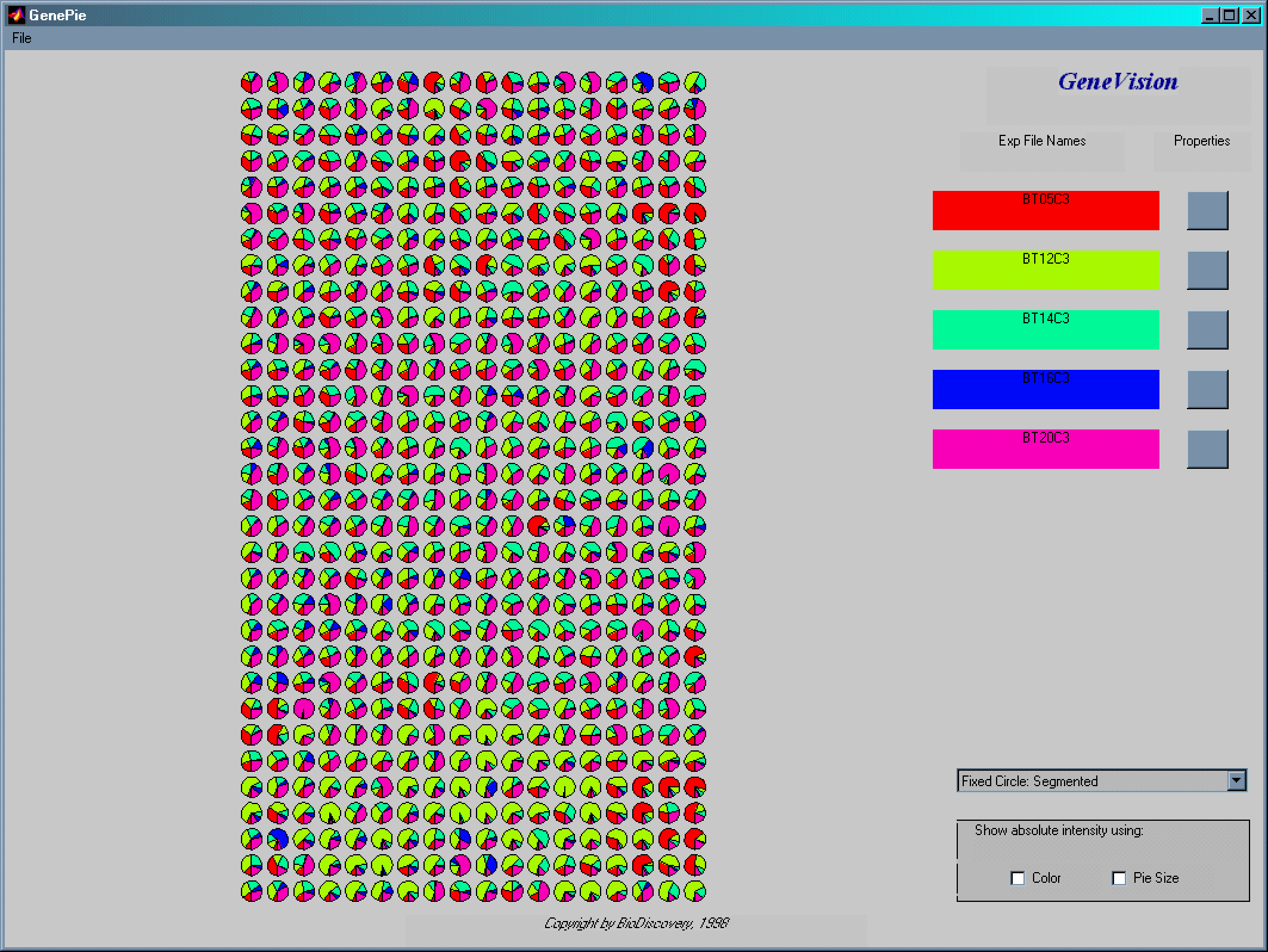
Simultaneous plotting of gene expression level comparisons for more than two experiments is also available.

By clicking on any of the pies in the matrix brings up the Detailed Spot Info window which displays the sample's images in all chosen experiments. The intensity value, standard deviation and relative ratio of expression levels are also displayed.