Time Series Analysis
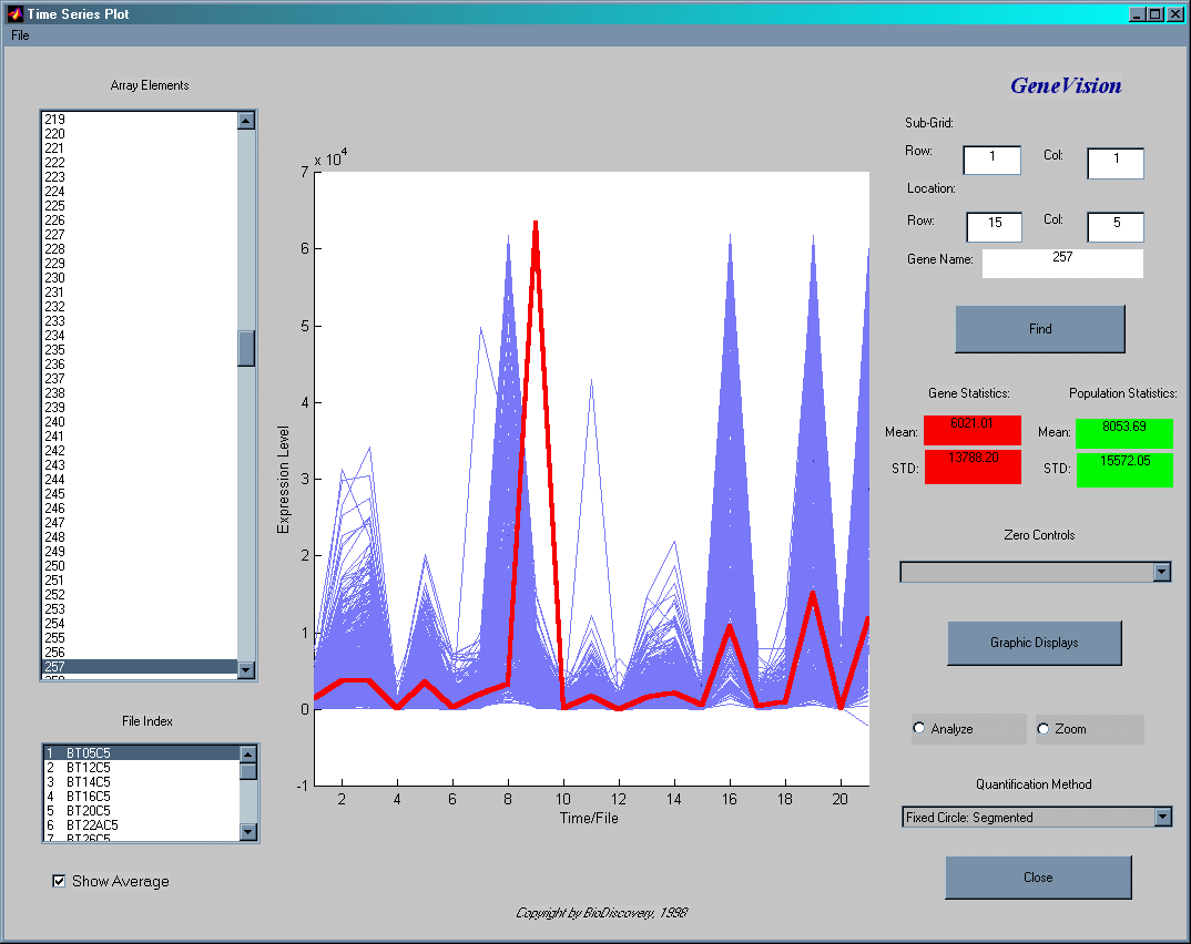
The Time Series Plot displays the expression levels of all genes across all experiments/files in the analysis. On the x-axis the experiments or experimental files are plotted. The y-axis shows the expression level of all genes across all experiment. This type of display is ideal for time series analysis since it makes very easy to follow the changes in expression level over time, but it could well be applied to any other type of data.
This example shows the expression levels (x-axis) of all 600 genes across all 21 experiments (y-axis). The red line indicates the expression profile of a selected gene in all experiments. The data could be searched by gene name, location on the slide or by selecting a pattern of interest from the graph.
The Time Series Graphic Displays window allows the user to plot the expression level of a subsets of genes across all loaded experiments. All genes are listed in the listbox Choose Genes to Plot on the left side of the window where the user can choose any number of them to be plotted. For 3D-graphs the x-axis indicates the file (experiment), the y-axis shows the chosen genes and on the z-axis are the expression levels plotted. For the 2D Bar display the 'x' and 'y' dimensions are collapsed into one.